Drawings
A set of artworks created during the university curriculum ○ 2010 - 2014
Below you will see a set of selected images using different techniques. During the university period, the curriculum focused on introducing various materials and techniques in order to develop the learner's skills and broaden their perspective.
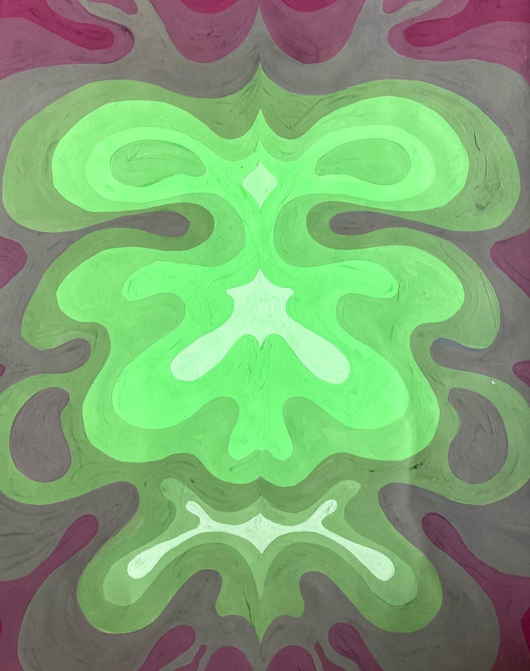
Movement
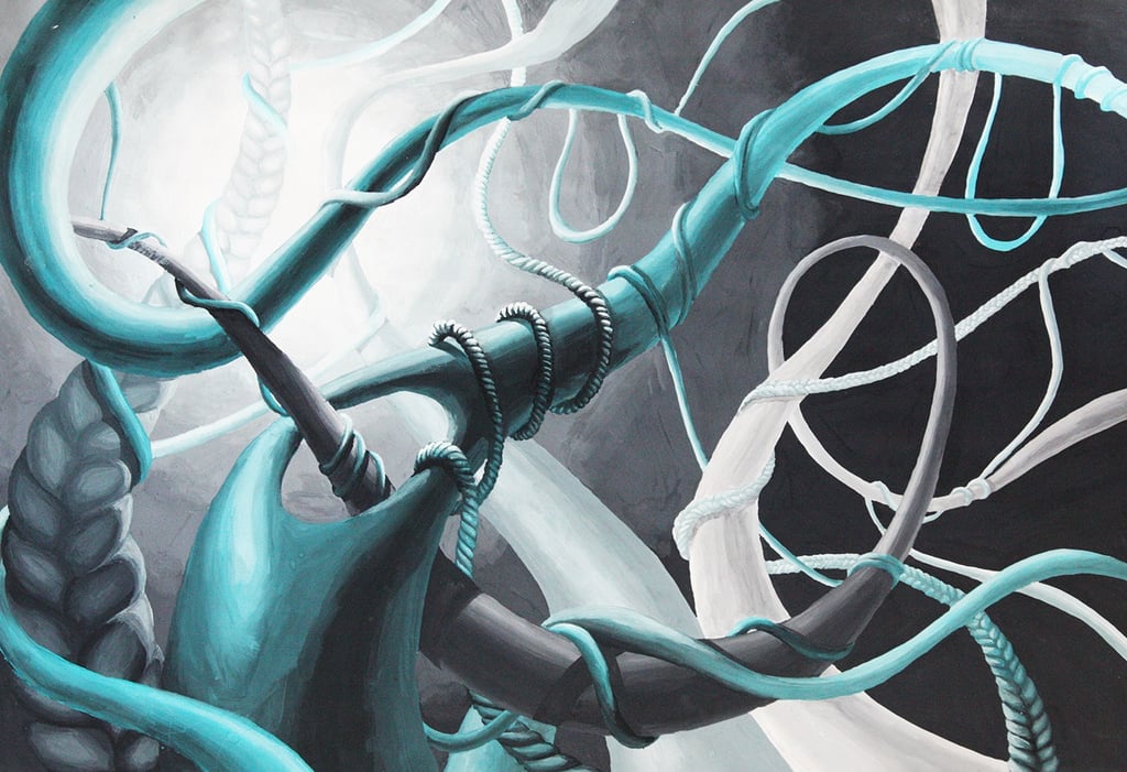
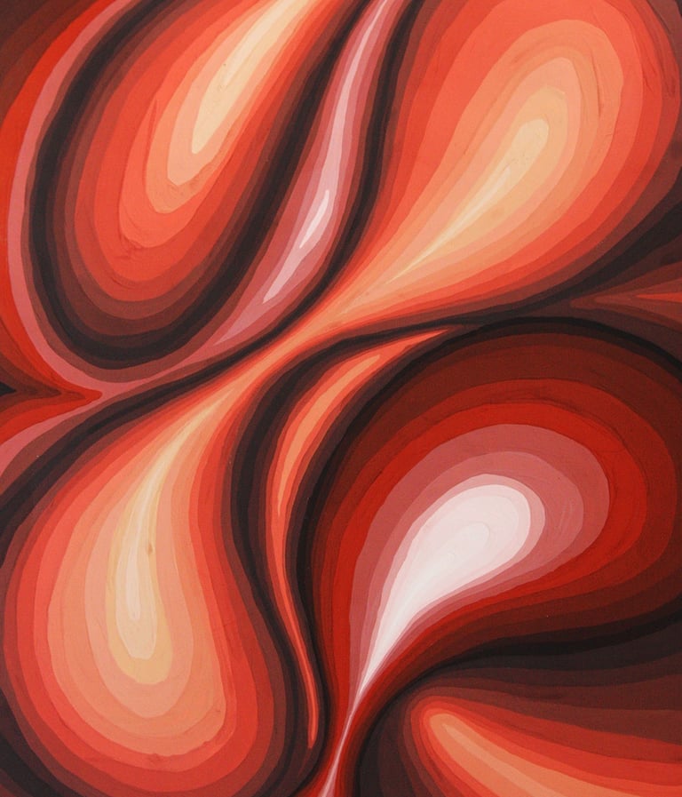
Material: Tempera
Year: 2012
The conditions of this task included exploring a transition between the shades of one single color. The drawing also consists of a single source of light and gives a clear sense of movement.

The mercantile woman
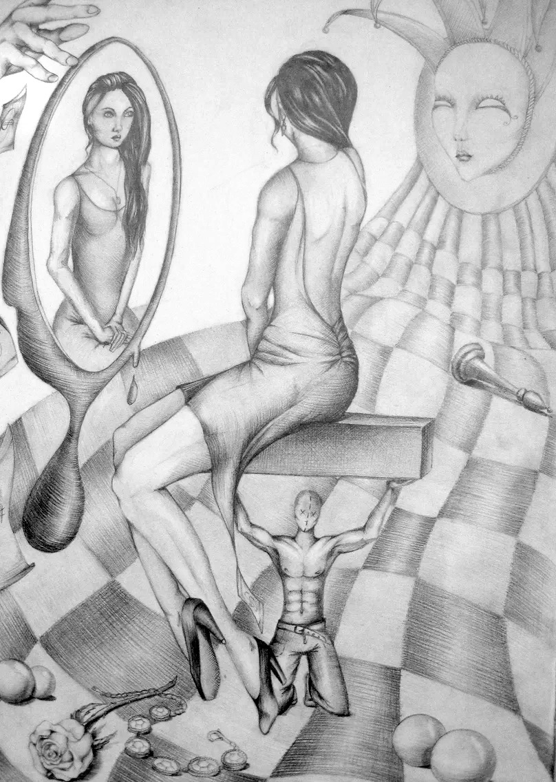
Material: Graphite
Date: 2012
An abstract painting featuring a topic by choice. In this case, I have tried to design the image while exploring different challenging areas (for me) for drawing - hands, perspective, mirror effect, the human body.
Alongside, a story is told, about the classic lady in front of a mirror, surrounded by beautiful objects, but placed in a world of masks and games where the looks and money have the most value.


The little rebel
Material: Graphite
Year: 2011
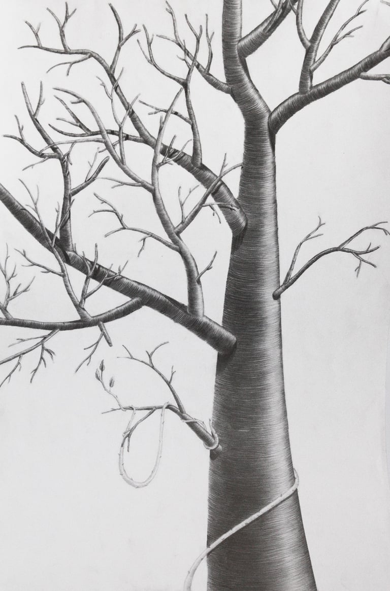
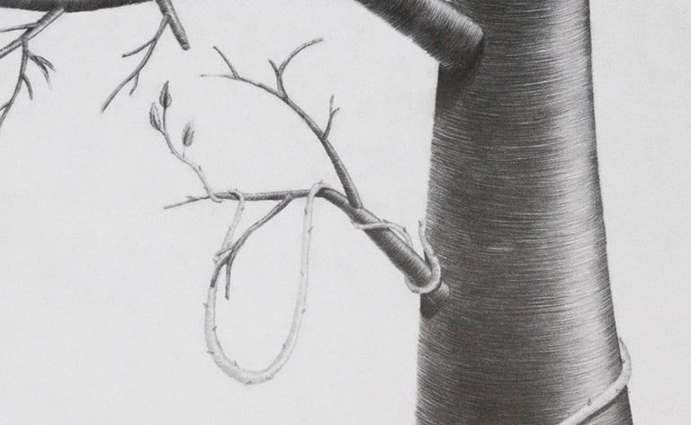
As per requirements, the drawing consists of an object of nature made of simple shapes.

Shapes
Material: Tempera
Year: 2013
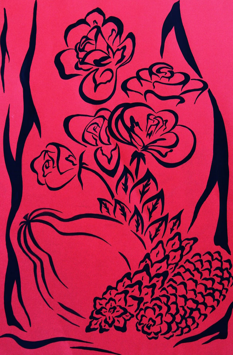
As part of the university curriculum at the time, we were presented with series of requirements for various paintings. However, there was this one, which was completely free of requirements.
I had observed this technique and wanted to create something similar to better understand how I can benefit from it. On the practical side... I detest pure orange, so I had lots of it and wanted to make use of it.


Abstract Composition
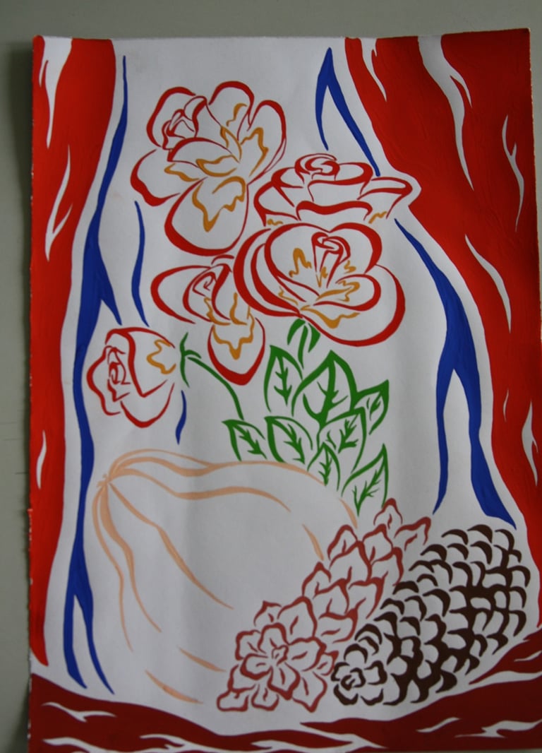
Material: Tempera
Year: 2012
An abstract version of nature morte composition. The task required both colored and monochromatic versions.
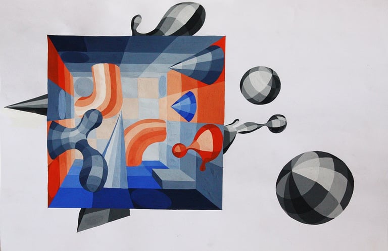
Square
Material: White Graphite
Year: 2012
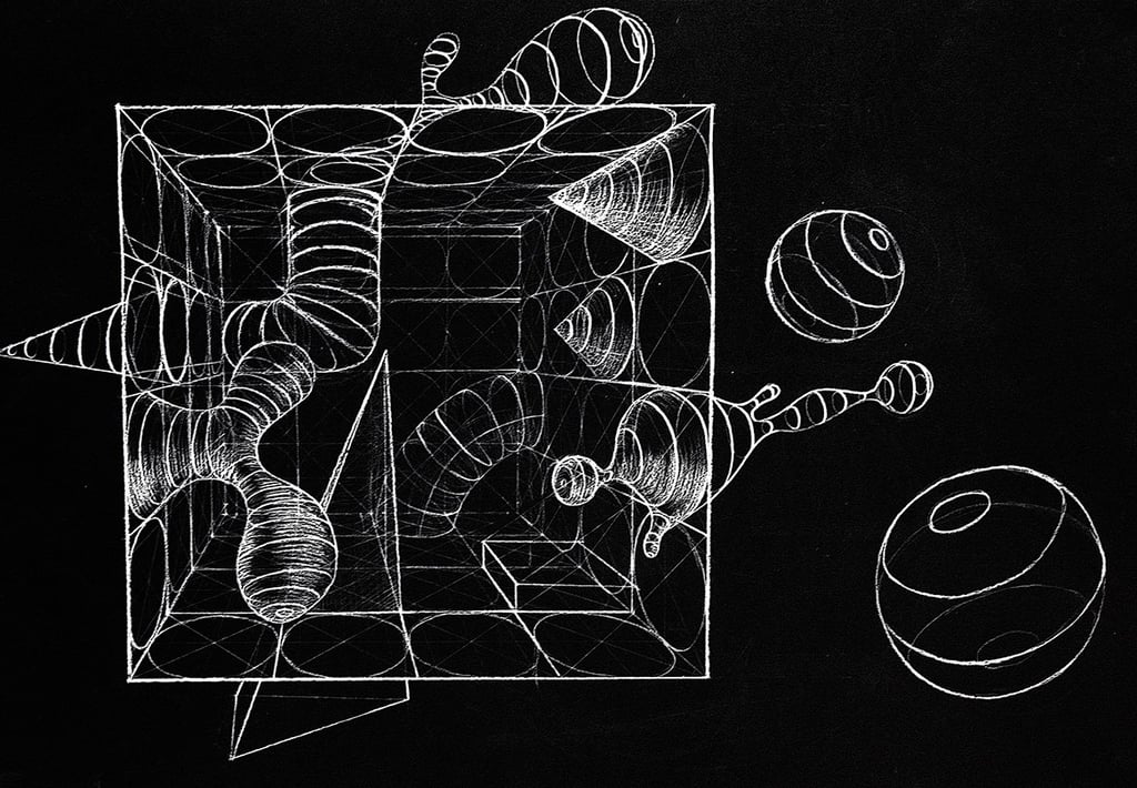
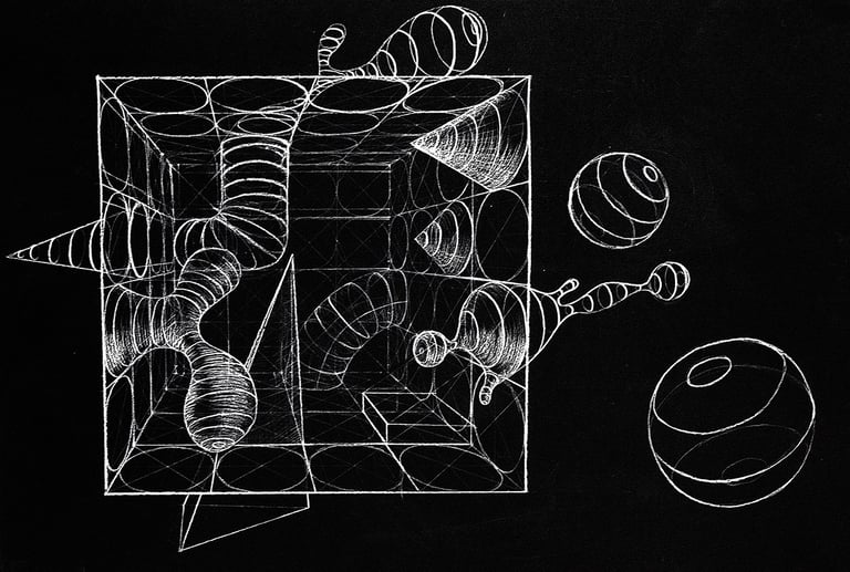
In these two pictures, you can observe a square room with the different objects coming inside and out of them. The objective of the task here was to get used to the room perspective, understand how shapes and in particular - circles are changing in perspective, be able to translate more complex shapes in that same perspective.
As you can see most of the contours are following the shape of the objects, which was necessary to prove understanding of the subject.
Since I have not worked with white graphite before I decided to get out of my comfort zone and experiment. The effect is quite interesting compared to the regular dark graphite.
Material: Tempera
Year: 2012
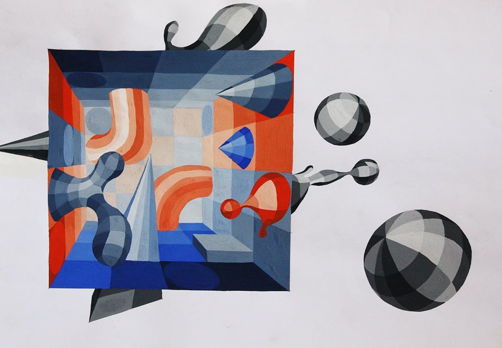
After completing the graphite version, we had to work on a color one.
Here I have emphasized the effect of the room by having everything outside of it monochromatic.
For the inside, I have used a classic combination of opposed colors with high contrast. Naturally, objects in the back are lighter, so the perspective in the room is more highlighted.
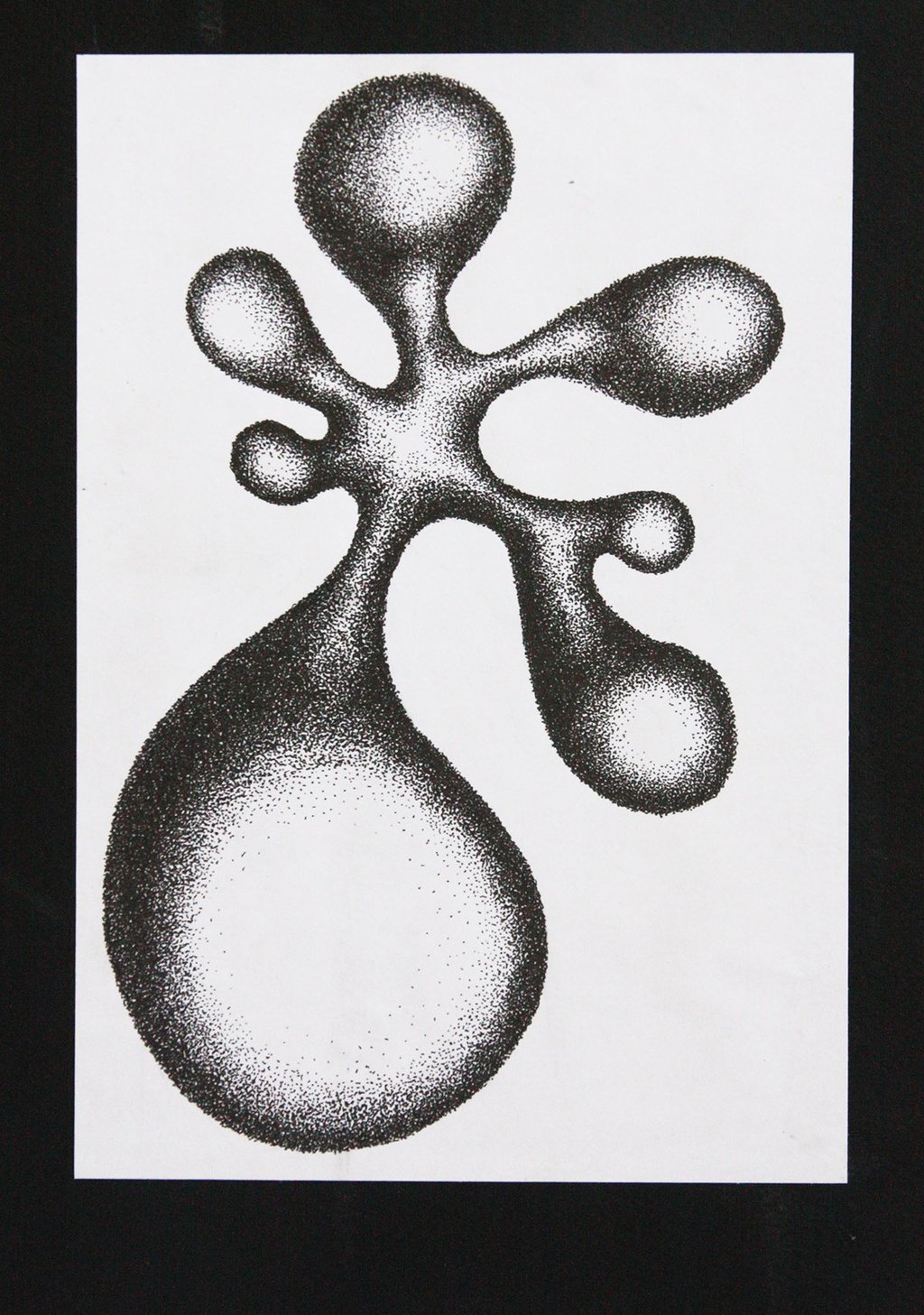
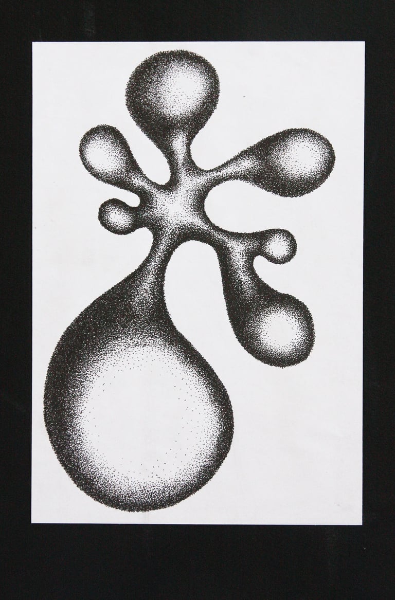
Composition of dots
Material: Ink
Year: 2011
A contrast between connected massive and thin shapes.
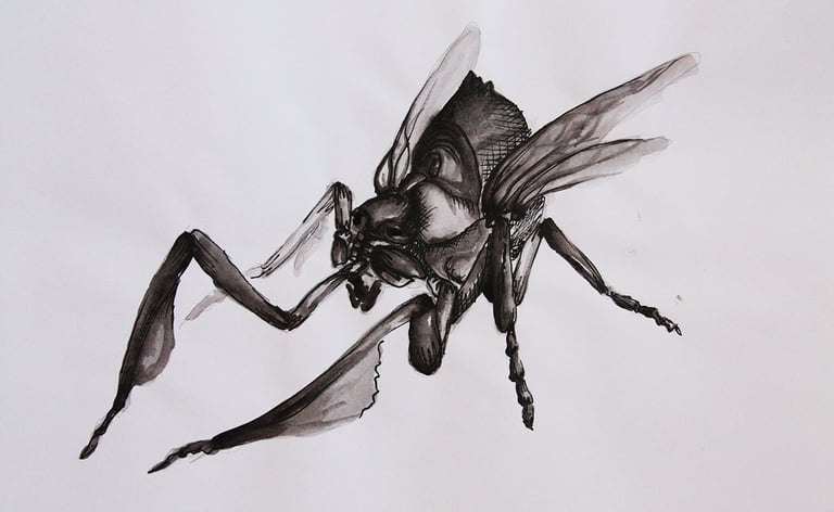
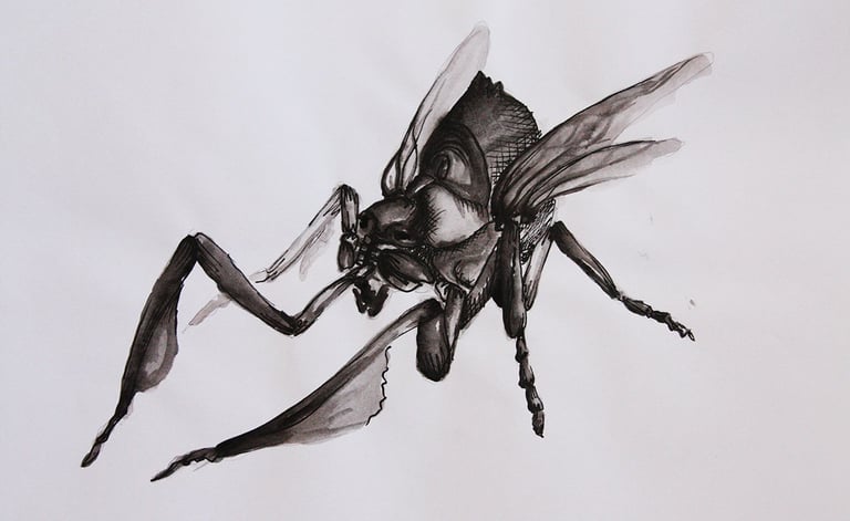

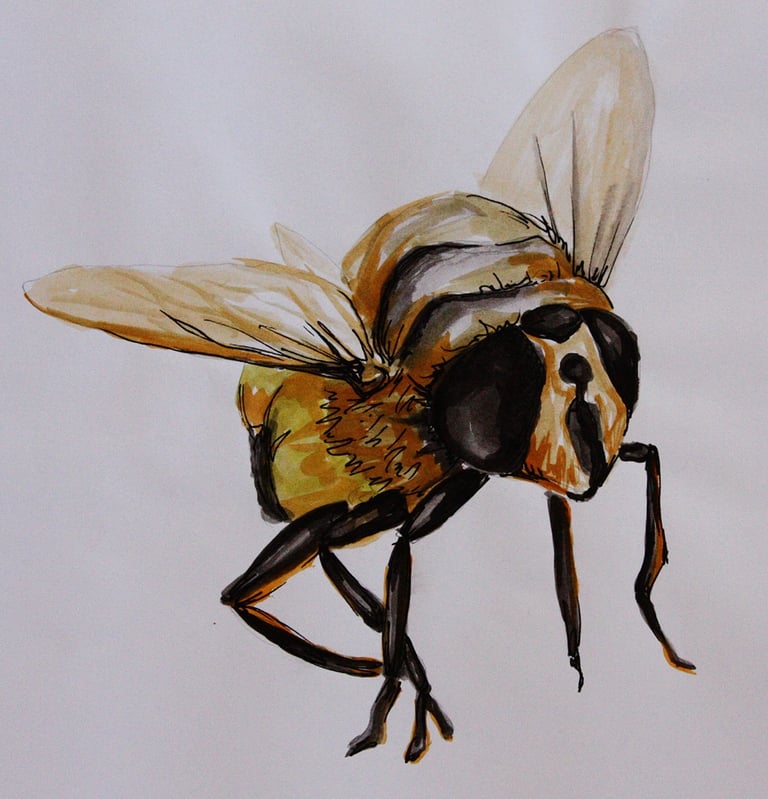
Insects
Material: Watercolor and Ink
Year: 2013
These two drawings were part of a project where the objective was to study the untypical shapes of insects and learn how to draw them using watercolor.
Autoportraits
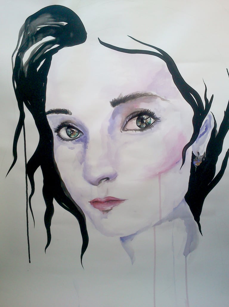

Size: 150x200 cm
Technique: Watercolour
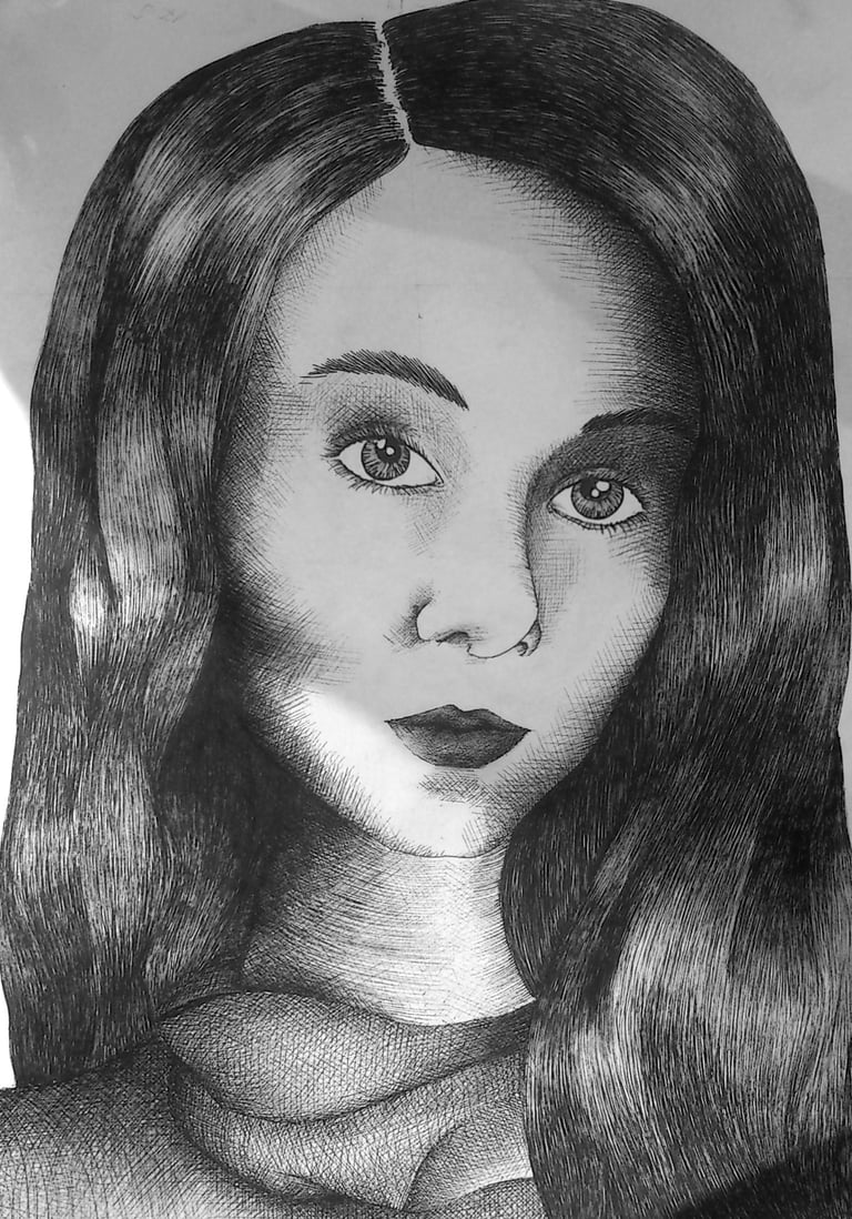

Size: A3
Technique: Ink
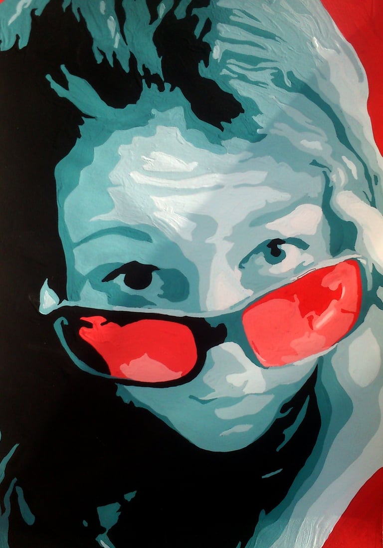

Size: A4
Technique: Tempera
Year: 2013
As part of a task in the university, I had to create a series of 5 self-portraits in different sizes with different techniques.
It was very challenging for me as I was not fond of the idea to draw myself. Additionally, the size of the biggest portrait was 150x200 cm and I had to tape the picture for the wall because I had no surface of this size available. Choosing to use watercolor for it was very strategical as, in my opinion, any other technique would have cost me too much investment.
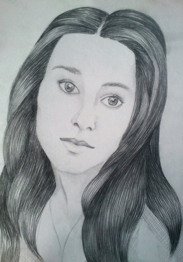

Size: A5
Technique: Graphite
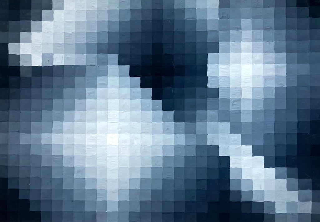

Pixels
Year: 2014
Material: Tempera
Size: A3
A composition of pixels with an illusion of various sources of light.
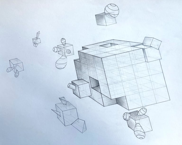

Perspective
Year: 2013
Material: Graphite
Size: A3
An exercise about perspective and how objects are influenced by it.

Extremes
Year: 2013
Material: Tempera
Size: A4
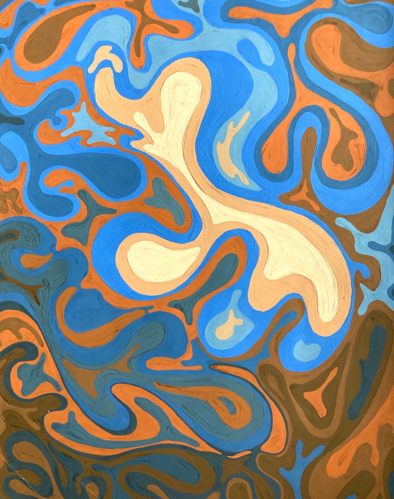
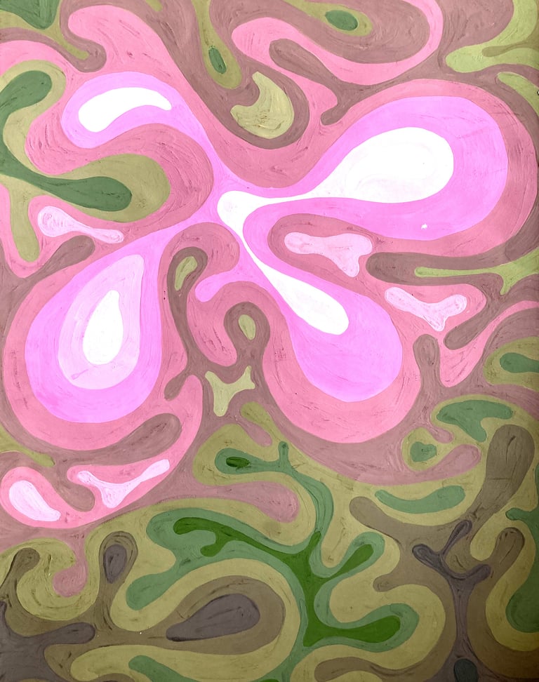
A set of exercises using colors from the opposite sides of the color wheel.


Bear

Year: 2013
Material: Graphite
Size: A3
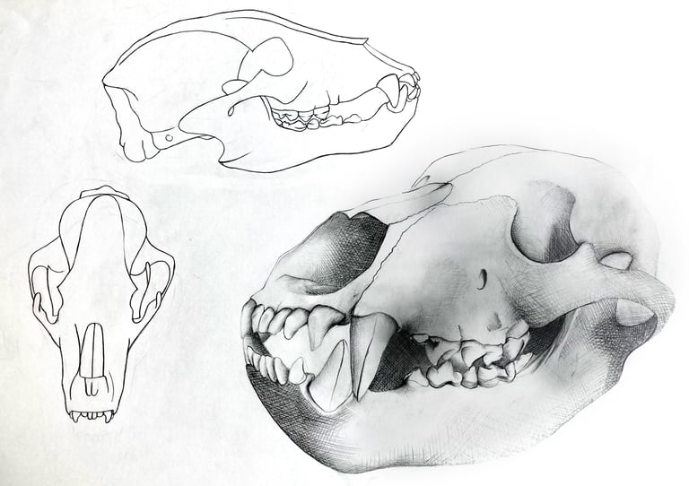
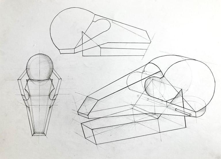
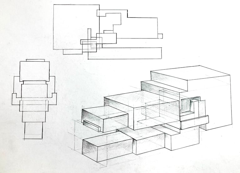
A bear skeleton drawn from reference. As part of the exercise, I had to create two more drawings with different levels of stylization of the same.
- One where I was allowed to use all kind of geometric shapes
- One where I had to use only rectangles


Bones
Year: 2013
Material: Graphite
Size: A3
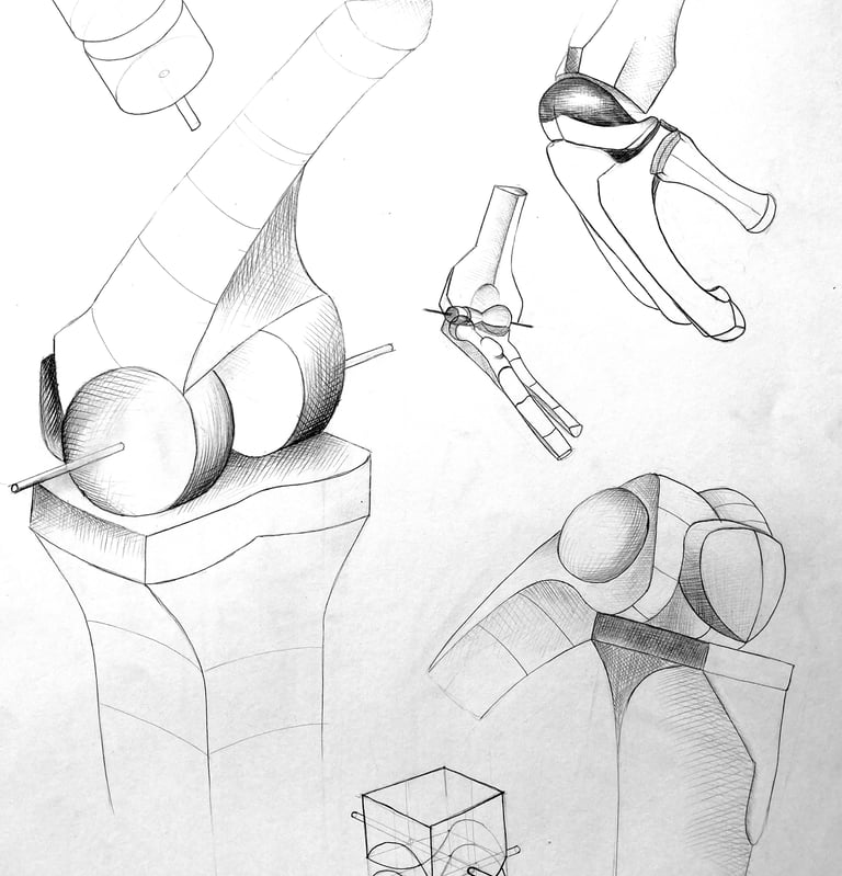
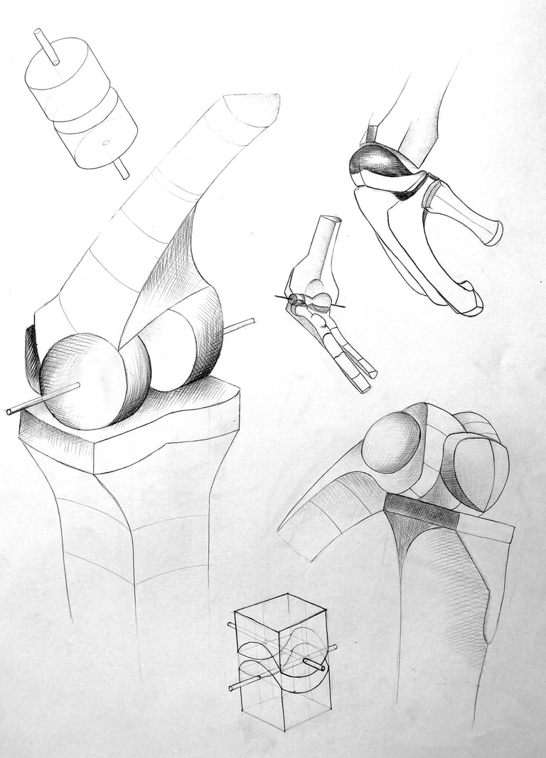
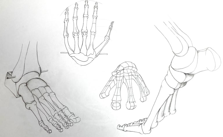
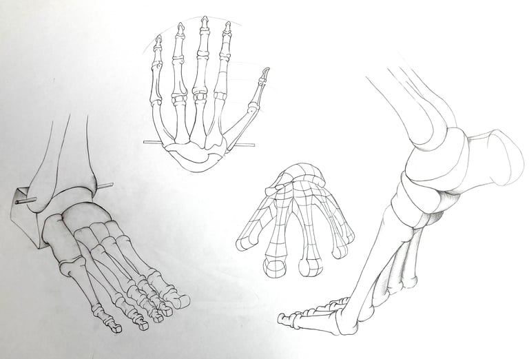
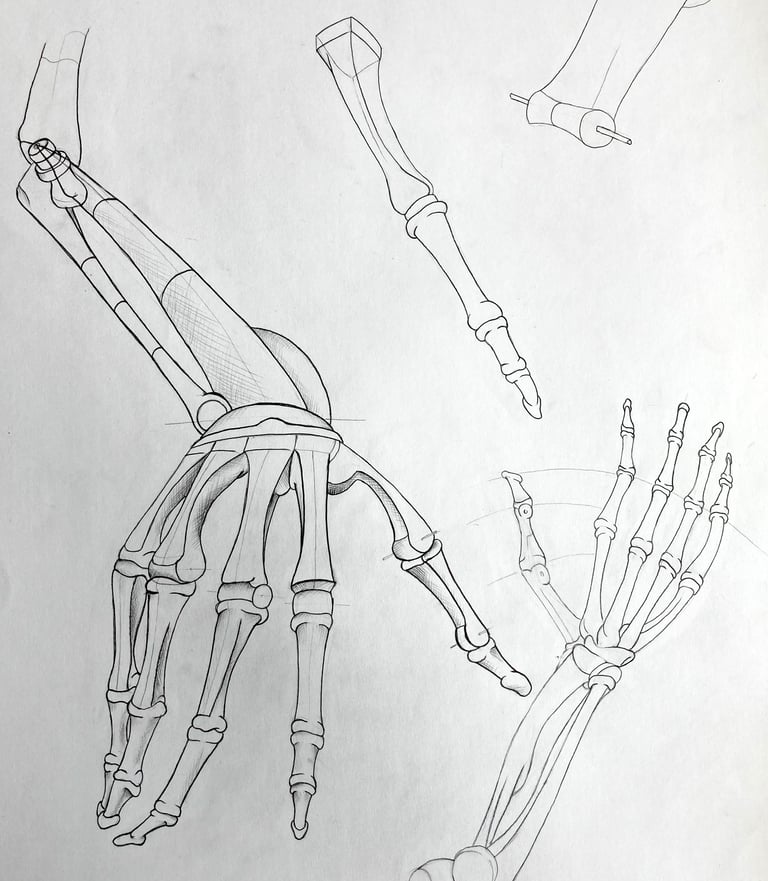
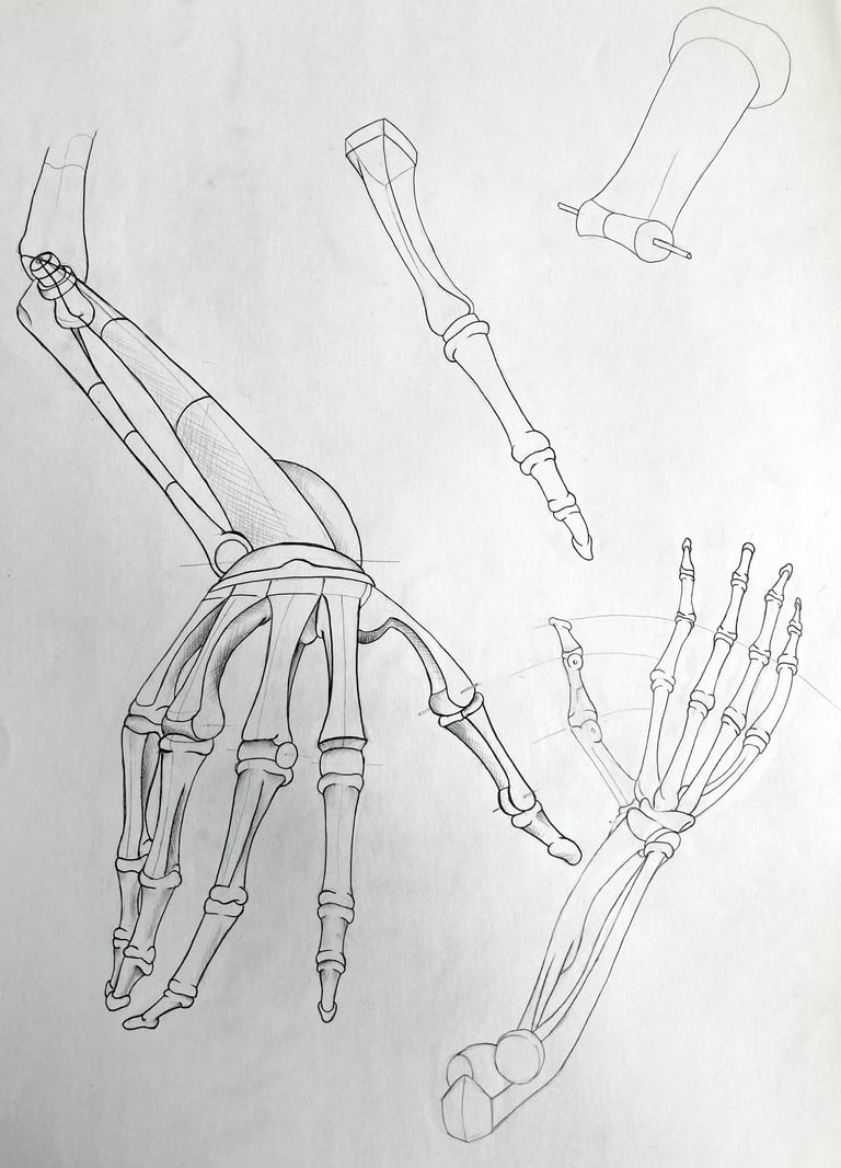
As part of the university curriculum, I was required to study the movement and structure of palms, feet and joints.
